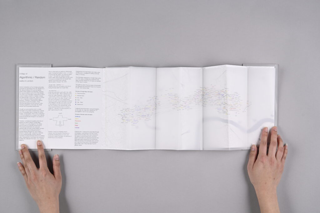
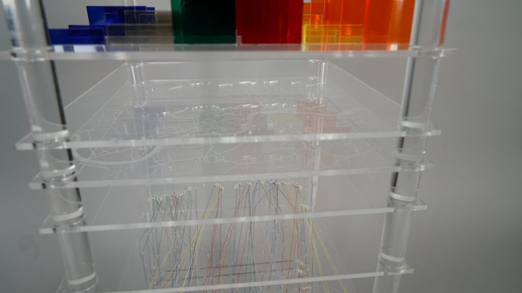
Internet companies such as Google personalise information by developing their own algorithms to filter data according to the user and quickly present these statistics as requested. However, this causes problems such as the ‘Filter Bubble’. This refers to an information environment in which a person isolates oneself in a ‘bubble’ of ideas and values similar to one’s own, which is a result of tech companies analysing people’s past behaviour. Therefore, I proposed two different approaches to solve this problem. Firstly, improving data literacy by promoting an understanding of algorithms. Secondly, the critical practice that incorporates randomness. I thought our own proactive action to obtain information in the midst of randomness could be one of the possible ways to change the current situation. Google Maps, which is the combination of GPS and algorithm, is unique in that it directly produces behavioural changes in our conduct in physical space. Therefore, I considered visualising what kind of algorithm is used to display Google Maps information to us using diagrams. The critical practice known as corporate randomness is influenced by situationists who advocate exploring cities and artist James Bridle’s conception of randomness as being generated in physical spaces divorced from technology. I devised a “random walk” using dice to traverse the city unsystematically, actively collecting information of personal interest during the arbitrary walks. Subsequently, a technique was devised to visualise this collected information using network diagrams. I walked around London, alternating every 15 minutes between Google Maps and dice rolling. I collected the data on Google Maps (information received passively), as well as the statistics I recorded of interest to me (information acquired actively). Both types of information were analysed quantitatively and qualitatively, respectively, and combined with flow and network diagrams to create a three dimensional model that resembles an architectural reproduction.
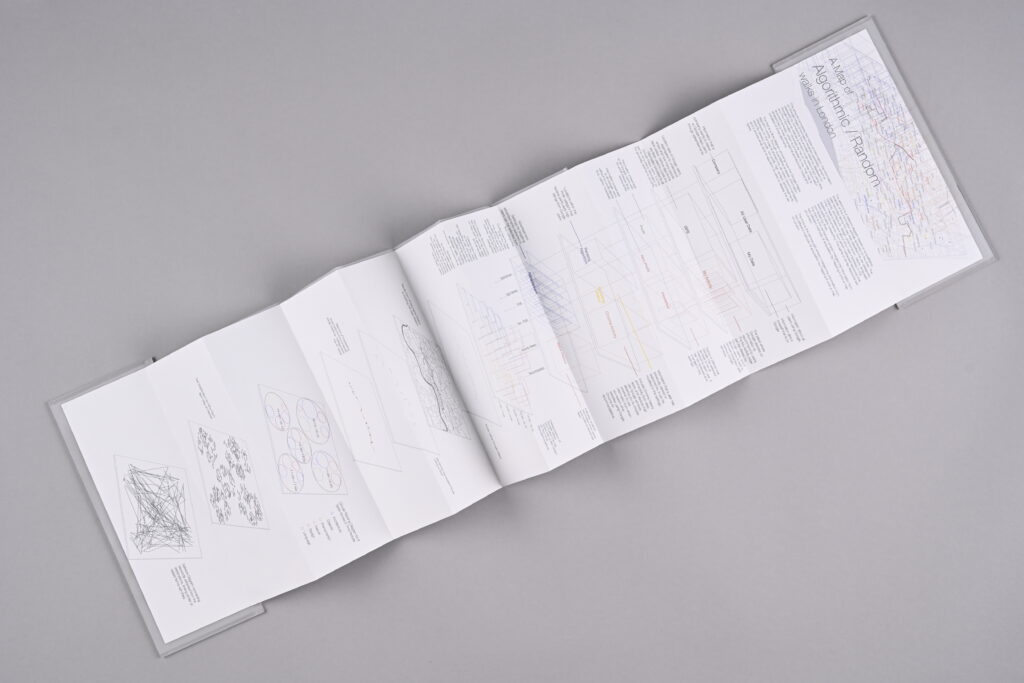
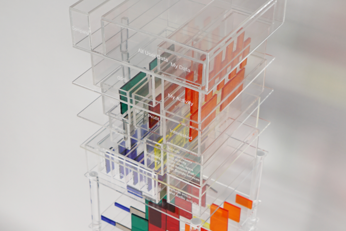
The first is a flow diagram showing how the Google Maps algorithm works. Through quantitative analysis, information displayed on the road is divided into six types (recommendation, recently viewed, profit, non-profit, high ranked, advertisement), and it shows what kind of algorithm is used to display the six types.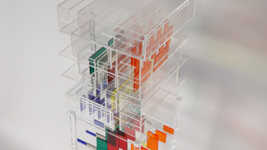
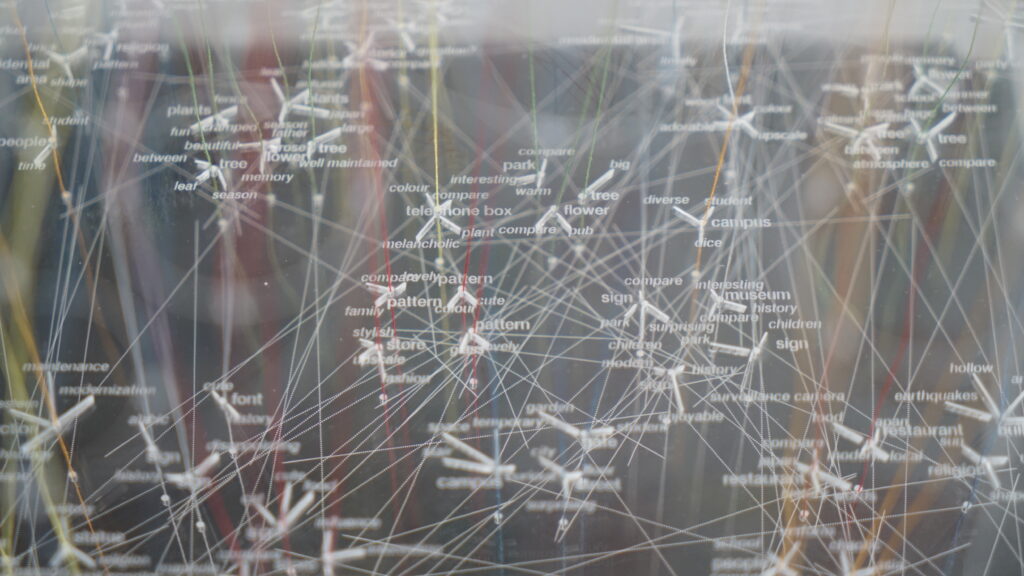
The second is a network diagram based on a qualitative analysis of the information actively acquired on the road. The data recorded along the way was classified into six categories (objects, architecture, design, phenomenon, nature, language) . I then made a statement about why I was interested in this aspect or phenomenon, from which I extracted keywords that were particularly noteworthy. The same or similar keywords are connected by lines.
The third is the central part where I merged the information from two different methods of acquisition by mapping it onto a map of London.
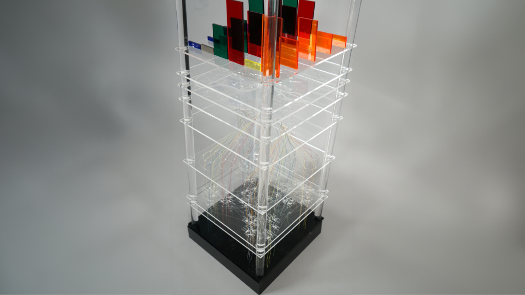
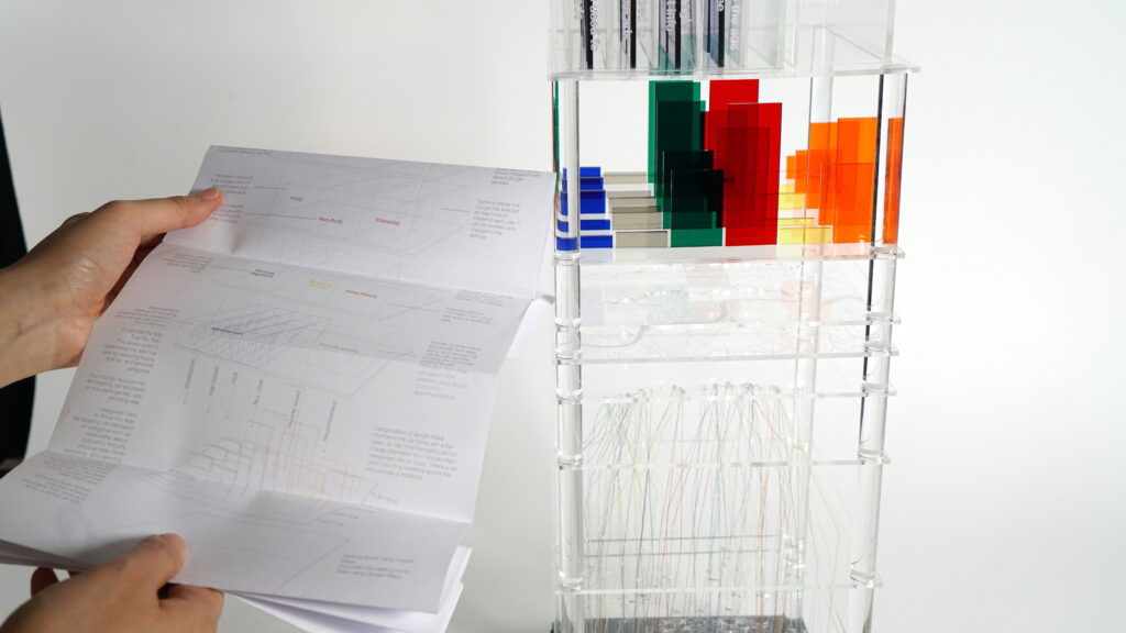
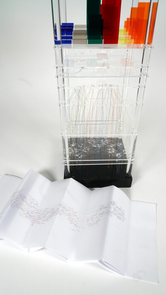
The architectural model of Master final project is designed to be easily navigable for viewers, with minimal explanatory details. To supplement this, a ZINE has been created in the form of an accordion-fold book that looks like a paper map.
The front surface of the ZINE provides detailed insights into each layer of the model, while the back side contains specific details of the data collection records that I gathered and mapped onto a London map.